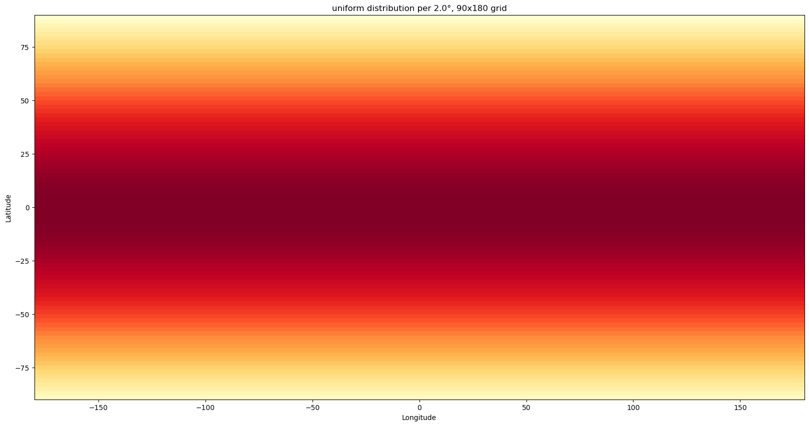
A cartogram is a map in which the geometry is distorted in order to convey the information of some statistic. I wanted to see what it would look like if the whole population of the world were distributed uniformly across the globe (including the oceans). The result is this Python script that uses optimal transport on the sphere to obtain this cartogram.
The script first finds the optimal transport map between the following distributions: the population count per 2°×2° cell, and a uniform distribution.
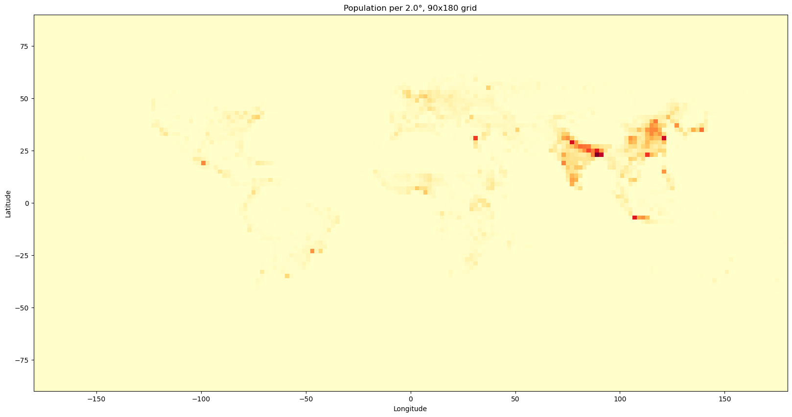
Using this optimal transport map, the script then produces the following animation, showing how the population, color-coded by country, spreads uniformly out over the globe:
The script needs two datasets: population density and countries. I used Gridded Population of the World, Version 4 (GPWv4): Population Count, Revision 11 for the population count and Natural Earth for the countries.
Specifically, the files are:
gpw_v4_population_count_adjusted_to_2015_unwpp_country_totals_rev11_2000_1_deg.tifne_110m_admin_0_countries.zip
Furthermore, the following Python libraries are used: POT for the optimal transport computations, GeoPandas for handling the country shapes, Rasterio for reading the population density GeoTIFF, and Matplotlib for plotting.